AT Park
During this project, we had to apply interaction design principles to evaluate existing experiences and identify interaction design issues. My group member and I decided to investigate the AT Park app.
Through the AT Park app, users can pay for parking in Auckland, monitor their parking time and locate on-street or off-street parking.
Scope:
Duration:
Tools:
Role:
Interaction design summative
Ten weeks
XD, Miro
User testing, Personas, High fidelity wire framing, Affinity mapping

CONTEXT
With the explosive growth of Auckland, flourishing restaurants and popular destinations have exploded in Auckland. Finding parking spaces has become increasingly difficult due to the limited spaces and high prices.
OVERVIEW:
In an effort to help with the high parking demand, we are analysing the AT Park application to see what can be redesigned and improved.
PROBLEM:
AT Park APP provides features such as paying for parking online, finding parking spaces, and getting directions to a desired location. However, the design of the UI app can be improved so that finding vacant parks and paying can be made much easier and more straightforward.

RESEARCH:
A survey was conducted after users tried some test scenarios on the AT park app.
SUMMARY:
The user interviews and surveys revealed that users want an app that provides efficient and easy navigation, along with coherent parking guidance. They struggled with the interaction tools, including buttons, sliders, and icons.
The goal was to create a minimalist user interface with a linear task flow instead of the open task flow the current app has. It is important to use minimal colours, recognizable icons, and interactive buttons to attract users with interactive feedback.
Based on the surveys, users requested a search engine in addition to clear comprehensive parking information and navigation features on the app


-
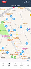
There are many parking spaces available, but no exact location is shown.
-
No search Bar.

-
The parking legacy is too small.
-
The parking legacy is not accessible after exiting.

-
Side menu shows up while swiping and gets in the way.
-
Suburbs does not include every area.
-
Not enough information about parking rates per hour.

How might we assist drivers to become more confident in finding parking that is convenient and cheap.
At Park app users have been interviewed to find out what their experience has been. We did this to find potential problems and pain points users may encounter when using the app.
There are drivers, non-drivers, workers, students who have used the app before and those who haven't.
After reviewing the variant answers, we decided to categorize them using affinity mapping.
COMPETITIVE ANALYSIS:
We also investigated other parking apps to find out what their key features are in order to fully comprehend how parking apps work. Two of the apps we investigated were Parkmate and Parkable.
Here is a list of the features offered by the three parking apps so that we could compare them. It became readily apparent which app had features not offered by the others.
In order to help drivers find parking efficiently and increase drivers' convenience, certain features are essential

PERSONAS:
Using the interviews as a starting point, we developed personas. Personas undergo similar experiences and face similar challenges as our users. This was so we could understand our users' needs, experiences, behaviours, and goals in-depth and help us design accordingly.
USER JOURNEY:
The user journey of a driver seeking a parking space has been visualized.


USER JOURNEY MAP:
According to the phases of the journey map, searching for a parking space is the greatest source of frustration for car drivers. A feature has been designed so that the app can reroute to the next available spot closest to the selected parking location.
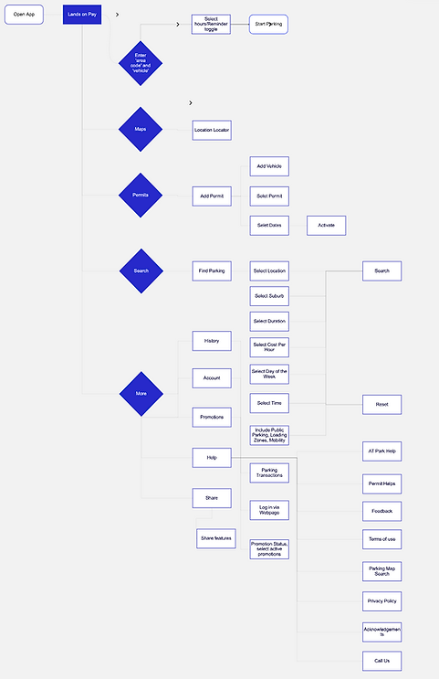
ORIGINAL USER FLOW
REVISED USER FLOW:

REVISED FILTER OPTIONS USER FLOW:

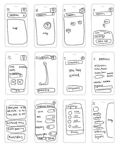
LO-FI PROTOTYPE:
One of the challenges many users faced was the interface of the AT app. Those circles that indicated parking spots provided no helpful information to users other than the existing parking spots in the area and not the available spaces.
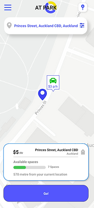
Through sketching and planning out the overall design. I decided to add car icons to allow users to identify parkings and colours with availability. Based on how they use the filter options, they would be able to access a variety of parking options.
WIREFRAME TEST & LEARNING
Using a simple grey and white wireframe prototype, usability testing was done to determine if the flow was easy to navigate.
To allow for maximum feedback and opportunity, users were given the task of looking for parking in a specific location with predetermined prices and hours. Users were also encouraged to verbally communicate their thoughts, feelings and thinking for feedback. Many useful feedbacks were gathered through observation and testing.
FEEDBACK:
Users prefer the modern interface compared to the Auckland Transport normal interface
They liked the car icon for parking options as it gave them a clear idea of where to park.
Information was too much for the users to read through. They would like a more concise version of parking information.
Users want to find parking with reservable options.

HOW THE DESIGN PROCESS WAS ACHIEVED
Users prefer the modern interface compared to the Auckland Transport normal interface. They liked the car icon for parking options as it gave them a clear idea of where to park.
Original Design

Numbers are shown on circles to indicate the number of parking spaces available.
Redesign

Red = Low Availability
Orange = Medium Availability
Green = High Availability
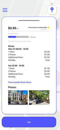
Users were able to link car icons to parking spaces instead of circles to indicate parking spaces. The colors continue to indicate space availability. The price input also makes it possible for users to view multiple ranges at once without having to click into individual information.
ESSENTIAL FEATURES
Search engine
Allows users to quickly and easily find the information they need without the need to search through maps.
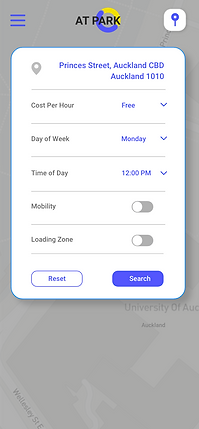
Advance search
Allows users to search for specific needs with filters so they can narrow down results.
Parking information
This helps users identify price, rating, number of available spaces and hours.
Driver profile
This helps users see their history, past parking records and their vehicles.
Payment
This can take the form of saved cards, Apple Pay, or other payment information saved to the account for easier transactions.
Notifications
Allows users to keep in touch with parking reminders and receive notices of time or other necessary and relevant information.

COLOR PALETTE

TYPE ROBOTO

CONCLUSION
The main goal was for drivers to find parking more quickly and more efficiently using the app. Our high fidelity interactive prototype has been designed based on research and user testing so users can easily find parking and utilize the app effectively.
WHAT IF?
What if we added reservable parking for the users?
What if we made an app that was accessible not only for AT Parking but also other parking companies in Auckland?
What if we explored a more interactive parking system that mirrors how parking meters work?
What if we tested the prototype on users while driving on roads?
REFLECTION
As part of our development process, we had to consistently invite users to test out prototypes. Due to other people's busy schedules, we could only test on 2-3 users each round.
It can be challenging to stay on top of deadlines and work around others' schedules. Sometimes user testing is left to a later stage than planned, delaying our process.
We all learned a lot from the group project of designing an interactive parking app. This case study explores the problems drivers encountered using the AT park app as well as how we approached re-designing it.