This project focuses on design principles and systems to create a graphic user interface (GUI). The course goal was to create a design system for a music player app. My goal for this project was to design a music app that is customisable to users and allows a tailored music experience.
Interaction design Project
Ten weeks
Figma, Miro
Research, High fidelity prototyping, Design system, Visual Design
Scope:
Duration:
Tools:
Role:
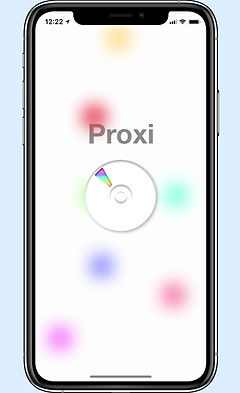
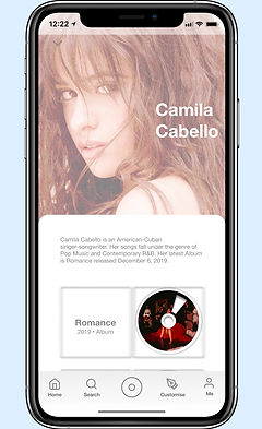
Proxi: Music Player App
CONTENT:
Currently, everything is oversaturated in today's well-developed market. It is now possible to stream music through a variety of media players. I am looking for a way to deliver a unique experience that the market does not yet provide.
PROBLEM:
The streaming industry offers strong experimental potential to test out limits and provide unique experiences. Identifying users' preferences and customising music player features are critical steps to achieving this.
SOLUTION:
In our project, we wanted to offer a new type of music streaming service not yet found on the market. Designing systems that allow users to create their own music spaces by personifying them.
HWM:
How might we support people to create a unique feature that solves the needs of listeners which cannot be found in highly developed markets.

RESEARCH
We conducted surveys and interviews with people around us in order to identify the most popular music player apps. According to our analysis, the majority of people are familiar with the features of common music players.
IDEATION
The plan is to make use of already existing features to implement additional customisation options. The music player should be able to be tailored to individual tastes. We want users to be as creative as they like with their interaction platform, to discover and personalise with their music space.
| PROXI Branding
Proxi, short for ‘proximity’ means nearness in time, space or relationship which is what proxi will bring to you. To allow you to customise your own music space bringing closeness and connectedness through music and space.
| LOGO Concept


Compact Disc
Colour Picker
+
=
Proxi Logo
| LOGO Construction
The Proxi logo concept is to combine a CD with a customisation feature which is this rainbow gradient. To inform you that the space is yours to pick from.


| COLOUR Palette
It is the purpose of the gradient colour scheme to motivate users to pick and choose their own desired colours for their customisable music platform.
| LOGO Typography
Helvetica Neue is chosen to be the default type of Proxi due to the modern and legible design that also lacks some personality to encourage users to change and try out other typeface choices.


| FINAL Logo
Proxi logo is designed to look vacant and incomplete to symbolise a blank canvas. The rest of Proxi’s interface will follow this minimal and blank state to encourage users to customise.
PROXI

APP ICON
1024 * 1024 px
00 PROXI
Proxi is an IOS music player that allows you to customise your music space. The simplicity the app brings shadows a blank canvas encouraging you to customise it to your liking. Proxi brings you a neumorphic interface allowing you to have a unique experience.
01 INTRO
Brand Name
Logo
Identity
02 TYPOGRAPHY


03 COLOURS


04 ICONS
Proxi uses simple and flat icons that are easily recognisable for users to navigate your way around.
05 BUTTONS
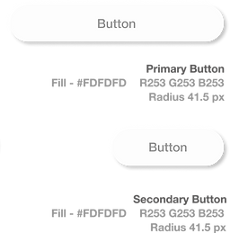
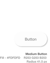
| 06 NEUMORPHISM Outer & Inner Shadows

07 ELEMENTS

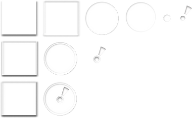
Proxi has a distinctive approach as it incorporates a Skeuomorphic CD style. This skeuomorphic design will allow you to interact with a real-life element on a digital screen.
1. Deconstructed
2. Built
3. Together
| 08 APPLICATION Map
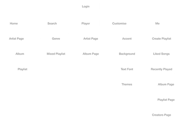
Proxi’s architecture focuses on easy and simple accessibility. The control bar will always be with you allowing you to have accessibility at every moment.
| 09 LAYOUT
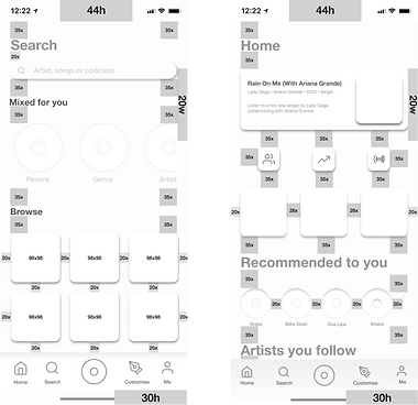
Proxi’s layout has been created using spacers to determine the spacing between components and relevant text.

| 10 CUSTOMISATION
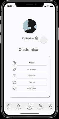
CUSTOMSE
YOUR
MUSIC
SPACE

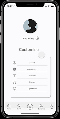
Features
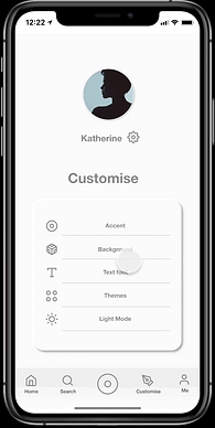
a page just for customisation
Allows colour customisation to your liking
Over 50 typefaces options to choose from
Pre-made themes
for you to choose from

HOME
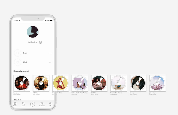
USER
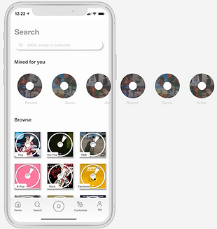
SEARCH
User page
View music
recommendations
| 11 PAGE Overview
Browse by
genre
| 12 MUSIC Player

PROXI


The design and learning aspects of this project have been a joy. A solid chunk of the atomic design principles has been incorporated into Figma library components, and I have applied theory to practice.
This short period of time has been stimulating for me and I have developed a more efficient routine during this time. Furthermore, Atomic design principles provide designers with a method for creating prototypes with increased efficiency and consistency. I would definitely continue to explore atomic design principles and challenge myself to more designs.
| CONCLUSION